What a cold and miserable day - I was thinking of you all! Well done for sticking it out.
I've started off with Penny and Elizabeth put together, for reasons which will become clear.
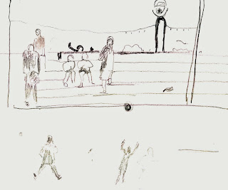
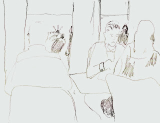
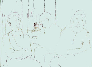
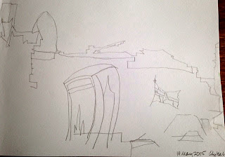
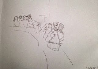
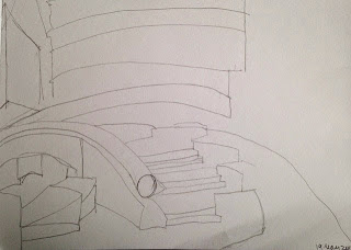
PENNY :- "Following your comments from last time I decided to spend some of my time trying to do gestural drawings of people that I might be able to incorporate into the paintings. Very difficult! Children especially just move too damn fast! So have taken some snaps on my iPhone to work from as well.
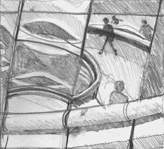
First drawing is taken sitting outside in the external “amphitheatre” looking at reflections on the outside of the building.
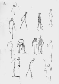
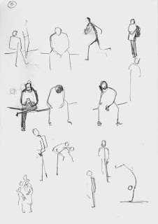
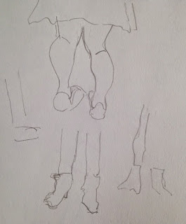
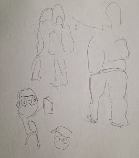
Second and third drawings are people outside, seen from inside the building sitting on the ramp.
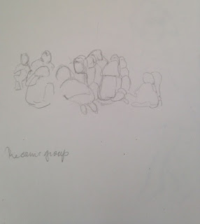
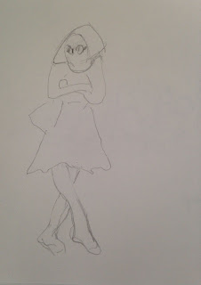
Fourth drawing is sitting on the 2nd floor viewing platform looking at reflections in the building. (Like last time.)"
 |
| Penny no. 1 |
 |
| Penny no. 2 |
 |
| Penny no. 3 |
 |
| Penny no. 4 |
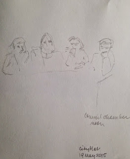
ELIZABETH :- "I am sorry some of these have not scanned very well so I hope you can see them. I started off outdoors but it began to rain so had to go indoors so there are some of the children on the steps and then turned to doing figures in the café. A bit less frustrating than last time and may be able to make something from them. I was going to do charcoal but it seemed a bit too messy for inside."
 |
| Elizabeth no. 1 |
 |
| Elizabeth no. 2 |
 |
| Elizabeth no. 3 |
 |
| Elizabeth no. 4 |
 |
| Elizabeth no. 6 |
 |
| Elizabeth no. 5 |
The reason why I've put Penny and Elizabeth together is (fairly obviously) that they are both looking at figures. Penny's drawings nos. 2 and 3 show her moving figures, and I like them very much. Penny - you've really thought of the figure as w whole, and felt the differences in weight distribution etc. there is still a tendency to do lollipop heads, but they are well placed, and work as part of the whole weight-thing. In each of them, we can read the energy of the movement - fast, slow, etc. Really good.
Elizabeth - thinking about the last session - do you see how Penny has drawn the whole thing? there was a tendency for you to do legs, then bodies, then heads and so the thing becomes more difficult to capture as an instantaneous thing, and you got very frustrated. This time, you have your two little moving figures at the bottom of sheet no. 2, and the rest of your studies are more close-up. I especially like nos. 3, 4, and 5. They have that touch of yours, that lets us in on intimate conversations, and unguarded moments - you are very good at those! No. 6 is intriguing with it's people apparently 'floating' behind. Keep practising the moving figures!
When you work up the more close-up drawings, remember what we said about the spontaneous quality - don't get too caught up in them being 'real' paintings.
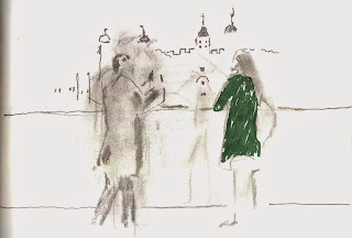
Penny - your other two pieces.... they are very exciting in their composition, with lots of opportunities for extrapolating planes and bits of perspective, and muddling up the sense of space. Your figures are not as convincing as your sheets of studies, but that's something you can work on. You need to very carefully place the figures though. I know they were in those spots, but you need to think of them very much as a rhythm, points of accent across the paper. The eye is going to go to them first, so maybe you need to think carefully about their tonal qualities (very strongly contrasting at the moment) I really like the ghostly image of (you?) in no. 4. Lovely.
This is followed neatly by STEPHANIE, who joined the group after a long absence, and said "Very much a question of warming up after doing no drawing at all for since last summer. Started off with blind drawing, and then quick looks at people — I was heartened by kind comments from the group, and that these look rather better as snaps."
 |
| Stephanie no. 1 |
 |
| Stephanie no. 2 |
 |
| Stephanie no. 3 |
 |
| Stephanie no. 4 |
 |
| Stephanie no. 5 |
 |
| Stephanie no. 6 |
 |
| Stephanie no. 7 |
 |
| Stephanie no. 8 |
 |
| Stephanie no. 9 |
 |
| Stephanie no. 10 |
 |
| Stephanie no. 11 |
 |
| Stephanie no. 12 |
Stephanie, it's really tough getting back into it after a break, so well done you. It's appropriate having you at this point, after the comments I've just offered to Penny and Elizabeth. The trick with figures is not to think of them as made up of all their component limbs etc. Penny had this very well sorted, and Elizabeth struggled with it last time especially. this shows particularly in your no. 6 and no.9. Interestingly, when you've drawn a group of people (as in no. 2 and no. 10), they are far more convincing. I think this is because you were looking at their collective shapes more than you were the individuals - and it worked. No. 2 has a lovely feel to it - the way some are leaning forwards and some leaning back - really nice. No. 10 is also really good because it is so gestural. We know it's a group of people, even though that is not spelled out.
Then, your blind drawings are great, especially the view across the river (no. 1) - you've got the essence of those wacky buildings! How about doing your figures 'blind' - then you forget about their arms etc. Try doing some off the TV.
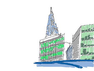
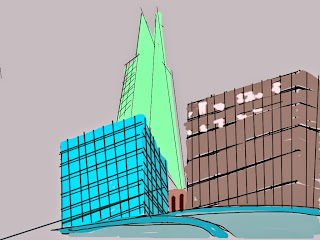
JANE had a patchy day, and worked on her ipad again, which is an exciting development.
 |
| Jane no. 1 |
 |
| Jane no. 2 |
These have a very confident feel. However, they do look a little like architects' visualisations. It's very difficult. I think the scale of the ipad screen might have something to do with it? It's easy for the materials (or, in this case, the technology) to take over, and forget the 'why' of the image you are creating. I'm not quite sure what you were after. Was it to do with the pattern/rhythm of all the windows and lines? Was it blocks of colour/shape? Was it the extreme perspective?
Sorry Jane - this sounds negative, but you need to let your tools serve YOU, and not dictate what you end up with. Have a good think what you can extract from these in the next step, and rein them back in!
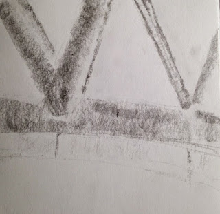
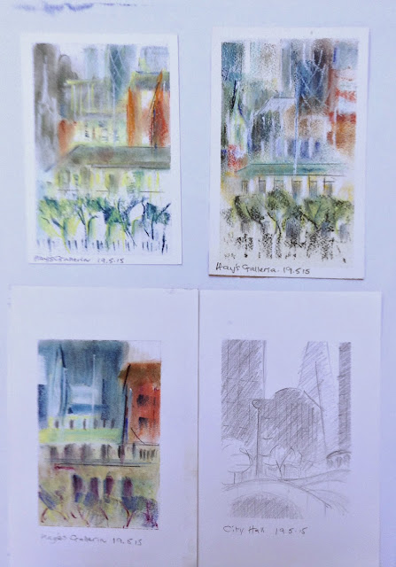
PAT K. says "The aim is to simplify the drawings".
 |
| Pat K. |
Pat, I'll tell you what you've done - - you've made a really good decision to zoom in, and fill the paper with a dense concentration of information, which is really good. This means that you can see the pattern possibilities, and the deign options, to work from. The drawings become a sourcebook for you to pluck from - areas of colour, areas of texture, areas of pattern. The crisscross on the Gherkin, and the rhythm of the windows will all be very valuable. Think of the trees in the same manner - they are not trees, they are a layer of texture and rhythm, for you to select from.
Really nice. I think you'll find these much more useful to work from. I can't wait.
