Thursday, 19 February 2015

EVERYONE'S WORK - NAT. MARITIME MUS. 17.2.15

I had hoped that half term would be quieter, without school groups trawling around.  I was wrong, and I apologise for that.
The four people who turned up were brilliant just to stick with it, and get something out of the day - well done.

ELIZABETH said :- "We had lovely weather again so were very lucky.
The only problem being half term it was very busy so I  was not able to sit
where I planned.  I tried to be big and bold as you asked. The last one is
how I felt at the end of the afternoon with everyone standing in my way and
moving while I tried to draw! It was nice to meet up with the others and
exchange ideas and gossip. It was also encouraging to get comments from
them."


Elizabeth - Greenwich Cafe

Elizabeth - Greenwich Cafe - Choas

Greenwich View


Oh Elizabeth, you are brilliant!   Each of these stands on its own, and need no further expansion.  These are not 'initial studies' - they are statements in their own right.
The blue one is fabulous, mainly due to its very, very clever use of counterchange.  The lights against darks, and darks against lights - even down to the one dark blue dot in a row of light dots.  THIS IS WHERE YOUR NATURAL STRENGTHS LIE.  The black and white one has similar skills, with a fascinating rhythm of light and dark across the paper.  The difference in the line qulaity is a joy, and terribly clever.
What both of these do is offer a really refreshing statement about human interaction, what happens when people come together - as couples or as groups.  I want you to think about why this can or cannot be 'IT' - the voice of Elizabeth Court.  Does it need to be painted?  Does it need to be 'more finished'?  To be discussed.  What do other people think?
Having said all this, I also really like the view across the park, with the very expressive long shadows, and the soft, runny foreground trees.  I KNOW what struck you, and that's what counts.  Agaian, i'm not sure what more you could do to this.

However, the main joy are your two figure studies.  They are a unique voice, and very accessible.


GERALD then said :-  "Not a very productive or creative day I'm afraid, too much wandering around looking for inspiration and not enough drawing.
No 1 The propeller looks particularly lame, like Mickey Mouse ears! So I took on board comments and have done a further thumb-nail to just suggest the turning blades.

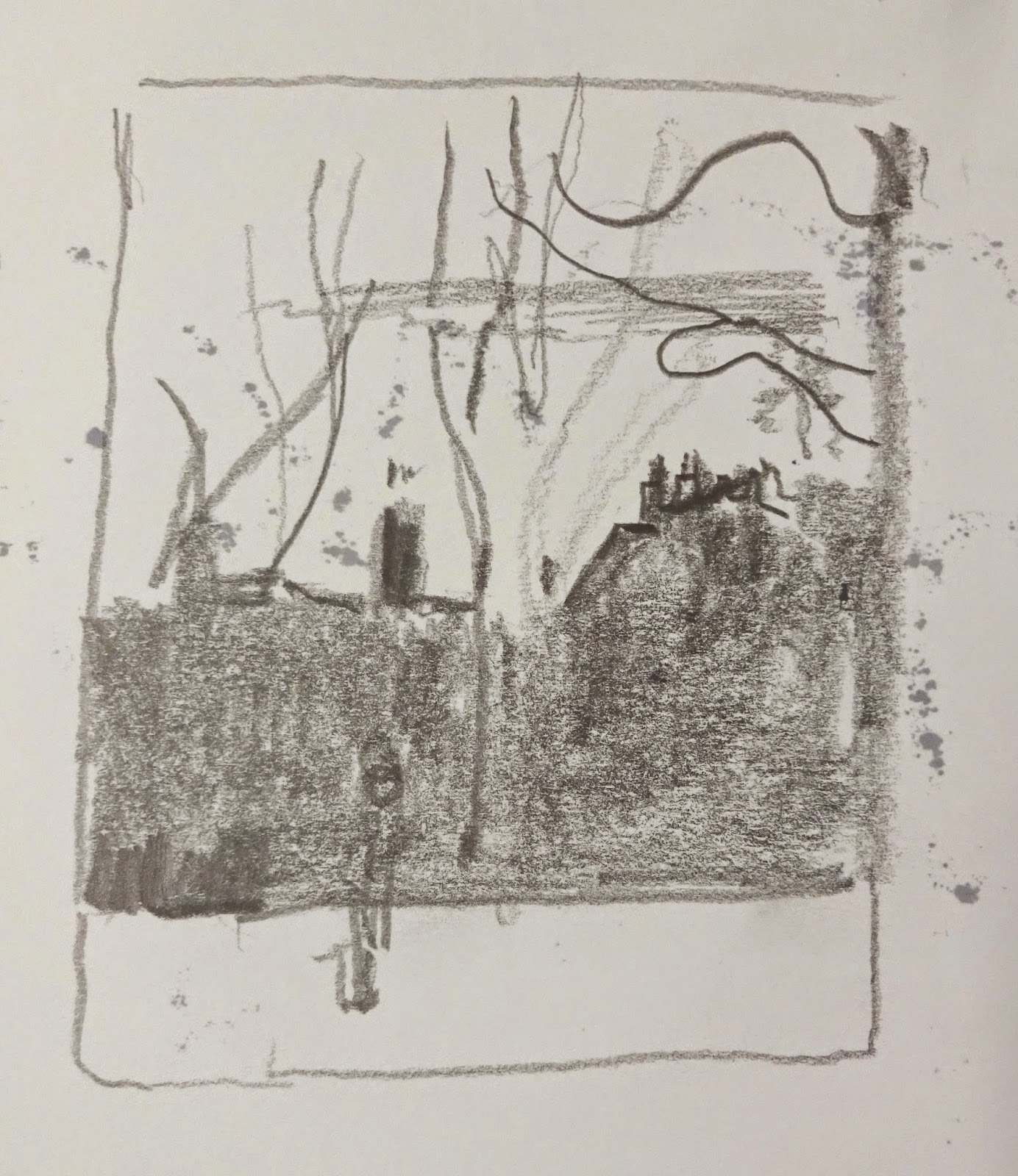
No 2 The view across the park to the Observatory. I was attracted by the rhythm of the tree trunks and will try to work this further into a painting.

No 3 The hanging lanterns. Possibly most successful drawing of the day. I was attracted by the points of light in an otherwise dark passageway and hope this can be developed. "

Gerald  no. 1

Gerald no. 2

Gerald no. 3


The propeller is particularly tricky, and last time Penny struggled with it.  The blades are such bulbous shapes, it's very difficult to do anything much with them.
You seem to be quite hooked on the strong dark shape of the horizontal beam, and the blades are almost embarrassed to show themselves against it.  What if you added some of the blades, or a portion of blade, to the black and white patterning.  Just because we all know that the blades were all made of the same material, and belonged to the same machine, doesn't mean that they HAVE to all be treated the same way.  That single black line across the picture doesn't help very much, as it is at the moment.

The landscape piece has promise.  as you say, and the rhythm of the trunks is indeed interesting (with subtle changes of rhythm across the span of them).  Consider also the rhythm of horizontals - grass, hill, trees, sky.  Could they enter into the rhythmic options? I can see you've toyed with the possibilities of what to do with the stretch of open grass - a rectangular block, or a diagonal lead-in - hmmm - so much to consider!

Your no. 3 has great promise, too.  Again, rhythm will be the main motivating influence on what you do with it.  Isn't that interesting

Why not think of the 3 pieces as being a set, all about rhythmic possibilities.  So your subject is not the 'thing', per se.  It is RHYTHM, and what you can do with it.  Up to you.

Well done though, in those tricky conditions.


Jane - staircase drawings

Next we have JANE, who wasn't there last time.  She said :-
"Here are my sketches. I was rather taken by the spiral staircase and shadows.
I took photos from Observatory Hill. Too many people there to feel comfortable sketching.
Lovely sunny day."


Well done Jane.  I'm glad you found somewhere to hide in the Queen's House, at least.
Very interesting set.  What is so good is the transition through the studies.  the first one is fairly obviously stairs, and shadows on the wall.  As we go through the drawings, the two things (one hard and tangible, and the other transient and insubstantial) morph together.  It all comes down to the quality of the curves, in the end, and no. 6 shows them off to great advantage.  No. 5 is different, because the stair-pattern has become a central rectangular block.  Clever.
One thing though.  The main compositional motifs are the curves against the rectangles.  I worry about the diagonal nature of the shadowed 'grid' in the top right quarter.  Diagonals don't really come in anywhere else, and it strikes a rather jarring note against the elegance of everything else.  What can you do - square them off? reduce them?
When you move into colour, remember what we were saying last time.  I'd like you to do some in colours mixed as neutral as possible.  Try mixing 5 versions of grey, all from different starting colours - you'll get lovely blue-greys, yellow-greys, pink-greys etc. which will blossom when placed against each other.  Once you feel comfortable with these, inject a bit of purer colour into one of them - and remember your tones - keep to your drawings.  Good luck.


Pat 1


Finally, we have PAT, who said :-  "Yesterday was sunny and warmer than our  first visit I decided to work on the interior space of the Queen's House this time. Working from the new drawings I aim to loose much of the detail and hope to find the sense of place-using colour to reflect the grandeur of the house."

Pat, I really like this set.  You've really thought about the SPACE - both the real space, and the space within your frame.  I like the fact that you can go into the picture space, and enjoy jumping across the surface, too.  2D and 3D in perfect harmony, different layers of looking.  Really good.  So, consider that when you are working them up.  That play on space can still happen, however abstract the piece.  I can't wait to see what you produce!  No pressure!!

Well done the 4 of you.  Lots of ideas.  


Wednesday, 21 January 2015

EVERYONE'S WORK - NATIONAL MARITIME MUSEUM


What a bright and shimmering day we had - the sun looked so inviting, only to confront those brave souls with bitter cold!

5 people turned up, and here's what they produced for those of you who weren't there..............

PENNY

Penny's drawings


Her first drawing (lower left) concentrated on the huge and slowly-turning propeller.  She wanted to give it the feel of moving, and tried things like overlapping the window, breaking the edges etc.  The comment was that the propeller looked quite organic compared to the hard diagonals around it, and maybe there was room to play with that idea.
then her next drawing (top left) was done in th Queen's House, and we all loved clever touches like the shard of black and white tiling on the floor, and the way she'd imported bits of paintings on display (old war ships) into the more formal space.
Then she did her 3rd drawing, which tackled the tricky issue of clouds and nature.  The formalised texturing of the trees etc. is very effective, but we all felt that the overlapping clouds looked a bit alien to the rest of the drawing.  Maybe they need handling in the same manner?


PAT

Pat no. 3

Pat no. 2

Pat no 1


Pat spent some time looking out at the trees in Greenwich Park, which were strongly back-lit to create dramatic darks (sheet no. 1).  I was a bit concerned that she might not have enough information on 'tree-ness-, but we'll see what she pulls out of the bag!  Then she went and sat in the cold, and did the drawings on sheet 2, again looking across the park.  Sheet no. 3 was a bigger drawing, containling lots of ideas to be played with, and whittled down.  
We talked about thumbnail drawings, and how they need to be different QUICK compositional ideas as to the possibilities of each drawing, not just smaller 'complete' drawings.


GERALD

Gerald 6

Gerald 5

Gerald 4

Gerald 3

Gerald 2

Gerald 1


Gerald produced some fine drawings (sorry - all of these seem to be coming out in reverse this time!)
No. 2, with the Royal Barge and its upright oars creating a rhythmic tension was a beauty, and very much reflected the ideas in no. 1, with the pattern of trees outside.  Isn't it interesting how two completely different subjects give the same visual stimulus?

Sheets no. 3 and no. 4 were all looking at the business-end of some big machine shaft.  we all felt that the one on the bottom half of sheet no. 3 was wonderful, where the description of the shaft has been reduced right down to just a circle, echoed by the subtle curve above it.

He hopes to somehow combine this with the squating figure drawn on sheets nos 5 & 6, so make a composite painting of some sort - good luck Gerald!


ELIZABETH


Elizabeth 6

Elizabeth 5

Elizabeth 4

Elizabeth 3

Elizabeth 2

Elizabeth 1


I think Elizabeth had a very useful day.  She devoted herself to exploring the opposites of tone and colour.  The tonal drawings were done with just b&w media, creating some very strong statements, again looking at the back-lit trees.
We all especially liked no. 1, with its Paul Nash-esque power, and the strip of light cutting across the dark - lovely.
Then, she used some coloured brush-pens which gave her no option but to use very direct colour to make here drawings.  The colours felt a bit shocking to her at first, but I think its a great thing to do for a while, and just see what strong statements emerge - there's no room for fiddling about in the middle!


MAGGIE

Maggie no. 1

Maggie no. 2

Maggie no. 3
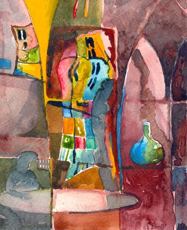
Maggie had a more indecisive day - not really sure what she wanted.  She started off (no.1 - bottom) in the Queen's House, doing a very powerful tonal piece, looking through from one dark room to another space.  however, it didn't really fulfill her need to 'tell another story'.  Her next drawing (no. 1 - top) was very inventive, looking at a group of statues, and rearranging their relative positions to create this striking and strange drawing with the pointing finger.  No. 2 was something she explored briefly, but it wasn't hitting the spot for her.  Then, no 3 was based on a wall-mounted display of ship figureheads, and she has again played with the narrative, and created something which provokes questions - and I love the space they're looking into.
She is hopeful that ideas will evolve over the next couple of months!


Well done everyone.  Next time (Feb 17th) will be without me, so let's see how these ideas develop onwards.


Wednesday, 14 January 2015

RFH WORK - notes

The thing that stood out particularly for me this time was the fact that everyone was letting their work grow FROM the drawings done on site, and not just doing colour versions of the drawings they'd done on the day.  This sounds so simple, but actually I think it's the first time when everything on show was this kind of development of an idea, not just a rehashing of it. Hurrah!

PENNY has kindly sent me her work, to remind me, as I'd not written notes!  Sorry again.

Penny no. 1

Penny no. 2

Penny no. 3

Penny no. 3, cropped
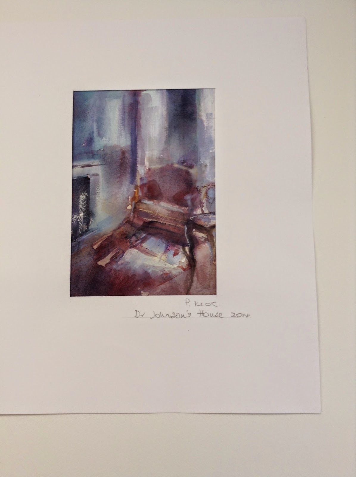
No. 1 has some of Dr. Johnson's writings embedded into it.  The thing I love about nos. 1 and 2 is the fascinating play with space and perspective.  It works very well in both.  No. 2 is a more 'conventional' statement, but with this special handling, it becomes something very special.
No. 3 is to do with reflections in the wobbly old glass of the bookcase, and we all felt it didn't need the extra bit on the far left, hence the cropped version.  Thanks for sharing those, Penny.


PAT K. really struck out for something new this time, in the form of using figures, really quite recognisable figures, in her work.  This might not seem so radical, but there has always been a difficulty in how to use figurative elements in combination with the more abstract nature of Pat's usual way of representing a space (or rather, the FEELING of a space).

Pat no. 1

Pat no. 2

Pat no. 3

Pat no. 4


The thing that really made these work is the way that the figures GROW out of the space.  They are not superimposed on a space, nor somehow seperate from it.  They belong to the space, and breath the same air!  This is particularly true of image no. 2 above.

Much discussion was had, and I think this needs to be explored further next time - play with the simplicity of the context, with suggested figures/objects growing out from it.  Very exciting Pat!


GERALD  doesn't stop developing!  He brought a fabulous set of rich paintings, where the paint (gouache against a dark ground) was really working to define the subject, and as with Pat's, the painting was not just plonked on the paper - it grew out of the paper.  Really great, Gerald.  This was combined with lovely areas of paint and drawing combined, to suggest heads/areas of detailing.  More please.

MAGGIE came up with two very simple (deceptively so) pieces.  They were glimpses through into other spaces, and she'd created a fascinating surface pattern with all the fragments that you could guess at through the doorways.  That surface pattern was a great counterbalance to the 3-D depth implied by the 'looking-through' description.  Very clever.

ELIZABETH had a great selection of different experiments - we can always rely on Elizabeth for pushing her ideas on.  Interestingly, the two that worked best were at opposite ends of the tone/colour debate.
One was a symphony of blues and golds as an overall colour chord, with areas of specifically TONAL definition, and fragments of light.
The other was a piece where she'd used lots of colour very cleverly, really understanding that the tones of those colours needed to be fairly even to make the colours really speak.
Then there were other pieces which tended to fall somewhere in between, so those two were the most successful, really.  It's totally OK to make paintings using each of these languages, but you just need to be aware of which one you're ending up with in each painting, so you don't get them all muddled, and have both contradicting each other in a painting.  Using predominantly tone doesn't mean you can't have lovely colours (such a s blue and gold) - it just means you can't use lots and lots of different colours and expect them to work at their best.

STEPHANIE re-surfaced from her book, and it was really good to see her.  She brought some landscape work she'd been working on.  My main comment was that she was trying to say everything there possibly was to say about her landscape all in one painting.  It's not possible to cram everything in, and make it still readable.  My suggestion was that she should us no more than 5 words to describe her subject (landscape in this case), and then paint that.  Then she could use another set of words to describe another aspect of the same landscape, and do another painting......and then another etc. - all from the same landscape, but all exploring different, simple aspects.

MANFRED had come to visit, and he brought several sets of photographs and paintings.  His paintings were delicious and simple evocations really, essences of a remembered landscape, but really strong and emotionally charged.  All they were really were arrangements of horizontal bands of colour and texture, but they were immediately about remembered landscapes in all our minds.  Very wonderful, and absolutely what I was saying to Stephanie, who was very struck by them.
LESS IS MORE - FOR SURE!

PENNY. I am really sorry, but for some reason I didn't make notes on you on the day - why??? I can picture some of the work in my mind, but not enough to remember my comments.  Oh dear.  You can send them through if you wish, or I'll add the comments next time.

Thursday, 6 November 2014

EVERYONE'S WORK - Dr. JOHNSON'S HOUSE 4/11/14

Well done indeed, the four of you who went along.  I think we will all be MOST impressed by the clarity and courage of your drawings, and your plans for what to do with them.  This is so exciting, as far as I'm concerned - your work is just so strong now.

Jill made the useful suggestion that anyone who couldn't make it on Tuesday could go along at another time.  I know they'd be more than happy, but just phone them first and check there's nothing big happening.

Also, I know you are all very concerned for Pam, and we just await news, probably via Jane.


I am going to start with ELIZABETH's contribution :-

Elizabeth no. 1

Elizabeth no. 2

Elizabeth no. 3

Elizabeth no. 4


She said about no. 3 : "This started off as shadows but then the sun disappeared and so did the shadows so I rearranged everything!   I would call it shadows of yesterday and today."

And then, about no. 4 : "My final attempt . I wish they could look a bit more controlled and orderly after looking at the others work. "

The thing I love about your work, Elizabeth, is the richness of your expression.  You have so many variations on your 'voice', each saying something different, but always distinctly 'Elizabeth'.
Last time, the conclusion was that your simple line drawing was a bit of a breakthrough, as it left so much to work on painting-wise.  This selection combines many things, but each drawing is more complete as it is than last time.  Each drawing can stand, very nicely, on its own, as well as being the basis for further work.  They are all lovely.  
No. 1 - I really like the clarity of tonal arrangement here.  The light through the window, echoed on the left, and then in the foreground.  That is what makes the picture.  the figure is a simple but strong suggestion - not over defined.  So good!
Then no. 2 offers more light and air - much less formal and more dreamy.  And ... a nicely placed patch of colour against the dark of the picture on the wall.  Very successful.
No. 3 sounds like it was frustrating, but often new ideas come from that sort of frustration.  I really like what's inside the shape in the middle, but I'm not sure about the way it floats against a sort of mushy sky.  Maybe if that was darker it would work better, or part of it at any rate.
No. 4 is really beautiful.  Pure Elizabeth.  You have such skill with your drawing.  Don't wish you were more controlled and orderly - others would wish they had your poetry!  The only thing to watch for is the cross monster-face in the picture on the left - 2 yellow eyes and a cross mouth!

As I said, these all stand as pieces in their own right.  It will be interesting to see whether or not they help you with further ideas, and whether last time's line drawing is more or less useful, or maybe a combination of all of them, with a little creative memory sprinkled in for good measure.

PENNY wasn't sure whether she's even make it, and had a short day because of the cold.  She said :-


Penny - 'Unused objects'

Penny - 'Security Objects'

Penny - 'Handled Objects'

Penny ' Books behind bars'


Influenced by Grayson Perry’s recent programmes on portraiture “Who are You?”, I decided to see if I could find any thing about Dr J’s house that I could use to turn my drawings from last time into more of a statement about the house, rather than just a spacial description.  So, I spent the first hour just looking and making notes.  e.g. 

Anti-slavery, black servant was Dr J’s heir.  But - “A woman preaching is like a dog walking on it’s hind legs”!
Security a problem at that time - hence the chain.
Chinese links - porcelain, stone from great wall(?)
Chairs no longer to be sat upon today.  Books not to be opened.
Conflict between the occupants.
etc. etc.

I don’t feel I got anything much that I shall be able to use, so not a great day.  This needs more thought!  Will proceed on last time’s drawings and see what happens.

You certainly set yourself a challenge, Penny.  If anyone hasn't seen the Grayson Perry programmes, they are well worth watching if you can access Channel 4 OD. He was making 'portraits' of people, or groups of people.  The actual representation of the individuals were there, along with all sorts of bits and pieces, and references, to their lives, and their 'identity' as individuals or groups.  Totally valid as part of a portrait, and a really refreshing take on how to encapsulate the complexity of an individual's perception of identity.
The difficulty with doing this sort of thing is how to balance the reproduction of 'reality' (eg. a face, or an interior) with the added bits - be they bits of photographs, or other fragments as in Penny's case. The two components of the expressive language of the piece need to work together, and feel that they belong to each other, not that one has been superimposed on the other.  This is Penny's challenge:  how to weave the bits and pieces into the interior drawings.
Penny also has another challenge - getting the message across - imbuing the painting with the 'feeling' of injustice, or prejudice (as we see it now) or whatever her statement might be.  Penny - remember the outcome of one of your Wallace Collection pictures - that a red slash was more powerful than a recognisable drawing of a sword.  Let the painted language do the work, rather than assuming that the association of, say a sword, will translate as, and be understood to mean, violence.  Your unused objects drawing has the beginnings of this through the way that everything is a bit wobbly and leaning.

Easy .... over to you!

Next, we have GERALD, who said :

Gerald nos. 1-4

Gerald nos. 5-8


"I think I had a good day yesterday despite the cold and rather gloomy views soon after 3pm. The four of us, - Pat K, Elizabeth, Penny and me, had a good discussion, including the benefits of watching Grayson Perry's excellent TV series. Our mini crit was also useful, with Penny asking where were my thumb nails, so I did one for my last sketch.

So I'm attaching a couple of pages of sketches where I've tried to be more daring in overlaying or combining images and simplifying others. I intend to combine no. 4 and 5 and perhaps put elements of no. 6 in with the others. Again how they will adapt to brush and paint is going to be a challenge, however I'm more confident since our last crit at RFH. "

Oh, well done!  It's great to hear you sounding so brave.  These drawings are most successful, and well balanced.  However, they almost go as far as they can as they stand.  The lovely balance of tones in no. 7 (?), and the simplicity of drawn lines in no. 5 are just great, and to try and 'reproduce' them in paint would inevitably be disappointing.  They are of their moment, and stand strongly as such.  So, doing some clever reconsidering of the content, combining images, pondering on the possibilities within what you've got etc. is a great next move.  So much is stored within your recollected reactions to what you were drawing, as well as the actual factual stuff, and as Grayson Perry eloquently showed us, these are just as important, if not more so!
So, Gerald, it might end up feeling ham-fisted and awkward at this stage, but persevere. Your own thinking is leaping ahead, and that's so exciting.


Then PAT K. sent the following in :-

Pat no. 1
 "Not really 'thumbnails' but made a conscious  effort to simplify the image Bottom left on second line I think came closest to this Will hope to carry this into 'work to be done.'-What a super place this is-quiet meditative-Exactly the place to encourage a change of direction."

I agree with you Pat, the piece bottom left is great. Lots of potential there.  Simple, and yet a strong, tonal, statement, and a nice combination of light and dark areas combined with the confident line-work.
I think the thing I'd just remind you of is to consider what your colours are doing for you.  The image bottom right is colourful, but are the colours acting as 'local' colour to illustrate a scene, or are they contributing to the expression of the piece - there's a difference.  The one you like (bottom left) doesn't suffer from this because it is predominantly tone doing the work.  The image top right uses colour and tone combined very well - the golden colour ADDS to the richness of the tonal statement.  Top left is a bit muddly as to whether colour or tone is doing the main work.  So, just be careful when you come to work from these - what is your colour contributing?

So - great stuff.  Well done.

We will, I hope, all meet on December 9th at the RFH.  I'll let you know about further plans nearer the time.

Monday, 13 October 2014

EVERYONE'S WORK - Dr. JOHNSON'S HOUSE 7/10/14

A very interesting day of people having to reassess what to do with a smaller, more intimate space, compared to the huge and complex possibilities at King's Place and its environs.  Several people fell into a rather humdrum trap, rather than keeping on creating original ideas.  We had discussions about this at the end of the day, concluding with statements like the one from Maggie, whose previous tutor had once said "who's permission are you waiting for?" (or something like that) - meaning that in the end, you only have yourself to let down if you don't push things to new and adventurous possibilities. I also chipped in, saying that I think we have a responsibility, as artists, to find an individual expression - we are not here to re-do what has already been done!


GERALD struggled with the problem above, having been such a star last time ( well, maybe he can't be a star ALL the time!):-

Gerald no. 1

Gerald no. 2

Gerald no. 3

Gerald no. 4
Gerald's main issue at the begining (drawings on p.1) was that he just plunged into them, without really thinking 'why', and not having any particular statement to make.  They are very nice little drawings, but not really much more than that.  No. 2 was a very interesting view of the stair well, and things started to settle into place then.  No. 3 and no. 4 show how he is thinking things through with a simple 'thumbnail' plan first, and then elaborating on it in his subsequent drawing.  No. 4 was right at the end of the day, and he was getting really into it by then, and couldn't quite stop!  Interestingly, Maggie pointed out that each of his compositions had a vertical 'block' running through the middle.  Very useful to spot things like this.


Then PAT K. also struggled!

Pat 
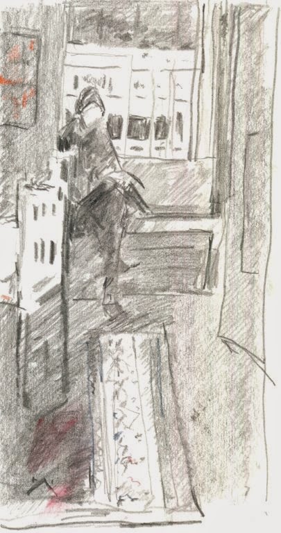
She was looking especially at the strongly silhouetted figures against a window.  At first, she got caught by drawing 'the figure' as a separate entity from 'the background'.  This rarely works.  What she needed to look at was the fall of light, and how that defined the figure AND the space around it.  This finally started happening in the final drawing (lower left).
She also did a drawing of a detail of the fireplace, just as a piece of abstract shape.  We'll see whether anything can come of that.


ELIZABETH however had a little breakthrough moment at the end of the day.

Elizabeth drawing

She had a day of studying little happenings outside the windows, using the window frame to create individual pictures.  These were drawn, with little touches of colour. Then, right at the end of the day she produced this line drawing.  This is really exciting as it offers so many opportunities for the next step.  Elizabeth's tendency was to explore the subject so fully in her initial drawings, that the subsequent paintings were less interesting.  This drawing, however, has a whole world of possible further interpretations.  Over to you, Elizabeth!


PENNY had a most interesting day:-

Penny 1

Penny 2

Penny 3

Penny 4

Penny 5


The coloured piece came first, and already she was exploring what happens if an interior line became an exterior line (or vice versa) - see the diagonal line.  This she then extrapolated further in no. 2, with the edge of the moulding on the door cutting across into the space created by the door. She also played with this idea very succesfully in no. 3.  This is SO clever, because it's twisting what we understand by space - spaces through; spaces across; divisions of space.  Great stuff, Penny.  No. 4 was based on reflection in a glazed cabinet, but the bit of dark detail on the far left was added after, to balance everything - it was made up - and why not!  No. 5 - look at the chair and it's reflection!
A real voice coming out here, Penny.


MAGGIE sent in the following :-

Maggie no. 1

Maggie no. 2

Maggie no. 3

Maggie no. 4

Maggie no. 5


Maggie's exploration was all about a sense of a space or presence unseen, or just vacated.  All her drawings show tantalising glimpses of things half seen through rooms, or behind doors.  She has used her components to brilliant effect to cut up the space in an exciting way.  I love the use of the chairs in no. 4 - they fuse together to make one big dark form cutting across the picture.
Another thing Maggie did was to specifically bring paper that had these taller proportions, knowing she was going to be drawing interior spaces.  Well done.  Not enough consideration is given to the outer proportions in many cases.


JILL spent her time very usefully, doing a meticulous set of drawings of a very complicated 3-tiered table.  She also snatched some quick figure when a group came in.  Jill, I know tables keep still and people don't, but try and draw your people with that same sense of 'not knowing the answer', with which you drew the table.  You drew it completely openly, not forcing answer on to it - treat people like complicated tables!!!!


Jill no. 1

Jill no. 2

Jill no. 3


JANE had to go early as she wasn't feeling too well.  However, in the time, she did some very complex line drawings of views through doorways.  We had discussions about how much she needs to be 'realistic' with the perspective.  Examples above show the two extremes - Maggie used perspective to add to the composition (especially in no. 5), and Penny deliberately played with hers, using it or flattening it as the composition required.  Jane also did some nice colour work - may I remind you about using those neutral/mixed colours as well, Jane.  Really useful.  I know it's difficult on the day, with limited materials.

Later -  Jane has just sent in these images.
Jane no. 1
Jane no. 2

Jane no. 3


So, well done everyone.  The next session will be on 4th November, and it was decided to try the plan of you going without me for another time, and see how it worked out.  I will contact you before then, and I will need to know by the 2nd whether or not you are intending to be there..

By the way, another artist to look at is Hammershoi (Danish? ) - have a look of Google images - beautiful compositions with a real attention to tonal arrangement.

Hammershoi interior
Or - completely the opposite extreme - Matisse/Bonnard interiors with all their COLOUR?

May I also pass on to both Pam and Pat W. all our best wishes for strength and better health.  We missed you.