Friday, 11 September 2015

EVERYONE'S WORK - 8th SEPT 2015


I have a selection of work sent from different references, so i'm going to start with the ones directly related to the visit to the Wellcome Collection on the 8th.  Funnily enough, this is one of those places that I was going to book up, but it was closed for refurbishment for ages, and i was always slightly worried about crowds.  I hope you found it a good spot!

GERALD first of all :-  "They are all orthodox sketches i.e. I was looking at the subject as I drew, but I was trying to work quickly and minimise detailing to record what was important to me."


Gerald no. 1

Gerald no. 2

Gerald no. 3


I have just looked back at the last entry from you.  I think you need to stop gathering information now, and see which of these drawing styles is best for giving you freedom the be creative when you work them up, counterbalanced with enough information to satisfy your drawing desires.
Last time, you kept the detailing to a minimum, with some really quite open tonal blocking - working a lot from memory. This time you've gone much more for the structural drawing.  This is especially the case in no. 3, where the dynamic form of the subject is fully explored.  Nos. 1 and 2 have areas of skilled observation (eg. skeleton - is it a bit abused in its anatomical order??).  They are super drawings, but I can't say which form of information gathering will be most useful to you.  I think that needs to be your challenge for the forthcoming month - explore that question.


Next came PAT K, who has also sent in some work from previously, so I will deal with that later.  She says :-  

"The building and displays were interesting historically and also from recent addiitions to the building and recent discoveries in medicine.

I found the two images I'm including very relevant to the present building-1stKurt  Schwitters1922 collage. (image 2 below)-and 2nd image-Le-Corbusier& Pierre Jeanneret-villa Savoye 
Poissy1928-31-Taken from a book I have on Modernism."(image 3 below)


Pat Drawings

Pat image 2

Pat image 3
How very interesting, Pat.  I am assuming that you've sent these two images through because you like them?  Although one is a 2-D creation, and the other is a photo of something 3-D, they both have one thing in common, and that's their boldness and clarity of form.  There is no indecision, no fudging, no suggestion.  It is all very clear where one shape or space stops, and the next starts.  They are both very, very tonal - no colour, really in the 2nd, and an overal colour tint in the first.  It's the clarity of boundaries and decision-making which is so interesting with respect to you and your work!

So - your work.........  Drawing top left (1) HAS that clarity.  I can see what you were getting at, and it is a very powerful image. It is also rich in mysterious spaces and pleasing shapes. Bottom left (3) - ditto, but you may feel the image is a bit shallow in its possibilities.  Bottom right (4) is very bold in colour, which is again different for you.  I can see that you were really trying to be brave and push on to something else.  The one that is a bit more muddled, maybe, is top right (2).  I can see what it was, and you have tried to define your spaces, but it doesn't have the fascinating possibilities that no. 1 offers - places where the imagination can go.

And I think that's the key.  Rather than fudging the actual definition in the drawing/painting, make your decisions clear, but let those resulting forms do the work of taking the imagination on a magical mystery tour!  Very difficult, but your two illustrations do it, and your drawing no.1 does it. 


STEPHANIE managed to get to the Wellcome Museum, saying :-  As you will gather I’ve signed up for a painting course, all day on Tuesday at the Art Academy — it’s intended to try and help you find your ‘voice’. We will see.  I’ve recently been in Scotland, and made a number of landscape sketches, including some with some floppy watercolour.  I want to use them as the basis of the work I start in October on the course, but will bring them in December.  Difficult to capture on the iphone,  and I need more time to work on them.

I had a tense day on Tuesday, due to a lot of other stuff going on, so relaxed (or tried to!) by looking at the Sexologist Exhibition that was currently showing.  I had had in mind trying to do a really detailed drawing, so decided to copy the only etching that Van Gogh had ever done — of his doctor, Gachet.  It was a fascinating exercise, trying to render his strokes on the page.  As you can see by the  comparison  I only got part way through — and now, looking at them side by side, I see how much more work there is to do.

The other thing that intrigued me was a big, fat ugly sculpture called ‘I can’t help the way I feel..’ v poignant.  Done quickly, partly blind with a square bit of graphite. 

Stephanie drawing from sculpture

Stepanie Drawing from Van Gogh etching

Van Gogh etching
  I want to start with you rendering of the sculpture.  I REALLY like it.  That's what comes of working intuitively - you FEEL the form.  The varied marks you've made with the side and point of the charcoal are very powerful, and I can really feel the fatness coming through from your drawing.  Whatever comes from your new course, make sure you stick to partial blind drawing - it works so well for you, and stops you from becoming too stilted and self-conscious.

Then, your copy of the Van Gogh.  Again, you've got that lovely line, so I'm guessing these were made partly 'blind' too?  That hand is so very difficult, but you've managed to get it really well, and it helps to not think 'hand' while doing it.  It's just a set of shapes.
As you say, his mark-making and description of form and volume through these marks, and space behind etc. is remarkable.  Making it colourful without using colour!

I will be most interested to know how you get on with your course.  Enjoy.


ELIZABETH did not go on Tuesday, but said :- "I did not go today but they are a selection from what I have done over the last week. Some of the drawings concentrating on windows and some on some people worshipping. They kindly let me draw them."

Elizabeth no.1  'High Praises Ministry'

Elizabeth no.2 'High Praises Ministry'

Elizabeth no.3  'High Praises Ministry'

Elizabeth no.4  'Figure in Window'

Elizabeth no.5 'Figures by Window'

Elizabeth no.6  'Orangery'


This is definitely the right plan - just follow a couple of simple themes and see what you get out of them.  Just think of all the past greats who have just done that - Morandi and his bottles being just one.

The studies of the worshippers are very tender and beautifully executed, especially the first two.  I love the way you can transpose a drawing from +ve to -ve.

I find the window pieces quite magical.  You have played with the sense of transience and transparency with the figures.  Are they reflected, or seen through?  Are the even solid themselves (esp. no. 5)?  And then the way that you deal with the windows themselves - lots of little panes, each with it's own bit of handling.

I can't really add to this, except to say that you just need to keep exploring these two themes, pushing a bit more each time, and just see where they get you.  Familiarity will give you the foundation from which you can experiment.  Well done, you!


Lastly, I also have some other images from PAT K., worked up from last time.  She says " The aim was to simplify the image-subject.? And to add more colour-to aim to extend my usual palette"

Pat no. 1

Pat no. 2

Pat no. 3

Pat no. 4

Pat no. 5
 
Pat no. 6


These were sent in before you had your very brave day at the Wellcome.  I can see, already, that there is a desire to be more positive in your decisions-making about areas/colours/ tones etc.

Straight away, i will say that I like no. 5 especially, because the colour of the trees has been reduced, leaving them as an interesting TONAL area, and allowing the orange to come through against them.  No. 3 also has a very nice rhythm of the blocks against the sinuous shapes of the trees.  That leads me on to no. 4 - here the shape/colour of the trees doesn't add anything to the picture.  In no. 3 they make a lovely couter-rhythm.  In no. 4, they sit there (!) less effectively.  No. 6 has got a bit indecisive - especially visible against all the others.
Just be careful not to make all you little square shapes the same size and weight.  Look back at the Schwitters earlier - all on a theme, but with plenty of variety and movement too.


Anyone else to send in?  Penny? Jane ? Pat W.?

Please do, if you have anything to share.

Monday, 10 August 2015

AND.........Pat Wigdahl, of course!


Next time, I must know who I'm expecting beforehand, so that I can get everyone on one entry.

PAT W. has sent in these two pieces, saying :-  "Here are just 2 I did on the 4th. Drawing of Hayward area which perhaps I can "pattern"up in paint.  Hiding from the wind under Waterloo bridge which I found intriguing and which I would love to do again showing a much more powerful attack."

Pat no. 1

Pat no. 2


Pat, you remain one of our most clever members, even with all the difficulties you face at home.  You are absolutely right to be excited by no. 2, of Waterloo Bridge.  It is a confident and striking image, which grabs the attention just as it stands.  Very nice use of your paint/brushpen (?) to describe the planes and textures, and simple colouring to bring life to the piece.  I really like the courage of the tonal work.  Well done.

Your drawing of the buildings (no. 1) is more exploratory, containing lots of possibilities yet to be resolved.  I can see that you were felling your way through, and I know that if you approach it as a great big experiment, you will produce something exciting from it - or maybe even a series of ideas???

You have two pieces here which do very different things.  No.1 stands as it is, and for you to do something from it would require quite a bit of inventiveness, to move on from what it already offers.
No.2 does not stand on its own - it is a private thought-process piece, which is just part of the process into something new.

Both pieces absolutely valid and useful, in their different ways.  Really great, Pat.


Having said, last time, that I could look over whatever emerges from these drawings in September, I gather that some of you are planning to meet up at the Wellcome Museum - great!  So, maybe we can carry on with the "2 months out and 1 month studio work" idea that we used previously.  So, send me the on-site work in September, and then some resolved work in October?? What do you think?

Thursday, 6 August 2015

AND........STEPHANIE'S WORK!!


I missed Stephanie off yesterday, so here she is...........


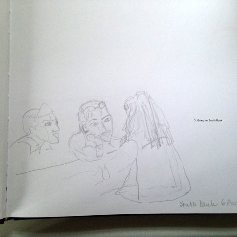
I felt I wanted a go at drawing people, get back to portraiture, so Elizabeth and I started the morning by drawing one another.  I am in outline in her drawing, but she is not (!) in mine.  Then I went outside to be beguiled by the fountains, but the wind got up and I got soaked.  I would like to see what I could do with making a grey painting of some aspect of this.  Next, a group of three in very intense conversation but the man on the right, with long dreadlocks is completely out of scale — so not very satisfactory.  The fourth was just trying to sort out what was going on at the edge of the Hungerford Bridge. It started as a blind drawing, but I got hopelessly confused…"


Stephanie NO. 1


Stephanie no. 2

Stephanie no. 3

Stephanie no. 4


The thing I find most fascinating is the difference in your drawing when you are drawing 'blind', and when you are 'looking'!!!

This comes across very clearly in this set.  The blind ones (semi-blind, in fact) are strong, confident, well seen, interesting and very useful.
Then, the two where you were 'looking' (nos. 2 and 4) are hesitant, drawn with an uncertain line, and much more self-conscious and afraid of being 'wrong'.  The difference is really amazing!

Let's start at the end - the group of 3 people.  I suspect you were very aware of them as 3 separate characters, and drew them as such - hair/eyebrows/sleeves etc.  If you had done them semi-blind, you would have seen them as one form, together with their table and their features, and everything would have locked together and worked proportionally.  Having said that, I like the profile figure on the left, leaning in.
The same is true for the water-fountain drawing - the wheel in the background is very shaky.  
HOWEVER, look at the complexity of the stuff you dealt with in no. 3 - no wonder your head started to explode!  But it's such a good drawing!  Ok, it's possible some bits appear in the wrong place, but that can be worked on with practice.  It's the quality of the drawing and seeing that counts.  Same with Elizabeth's portrait - not necessarily 'her', but totally a confident drawing of someone looking down and concentrating.

So..... more, and more, and more of these please, and then see what you can work up from them.  I will wager my hat on the fact that you can make something more from the Hungerford Bridge drawing than from the other two.  Let's see!

Wednesday, 5 August 2015

EVERYONE'S WORK - 4th August 2015


Well, this is exciting!  What have you all been up to?


The first to send in was PENNY, with the following :-  "Here are my efforts!  Decided to follow your advice from June and make drawings less finished.  So have not allowed myself to use tone (well almost not!)  
I think that, despite the incredible inaccuracy of the blind drawings, they probably provide a better basis for interesting paintings.  I intend to also follow your advice to try painting from memory of the more detailed drawings that i did at County Hall."


Nr 1. Kids playing in water fountains.

Nr 2. Blind drawing of helter-skelters and voids in building opposite level 4 blue bar.
Shading done after - probably should have left as line.


Nr 4.  Blind drawing looking down from blue bar window.

Nr 3.  View from blue bar.
Nr 5.  Same view as Nr 4 but looking.


Penny, I think these are tremendously exciting, as are your plans to work from memory to some degree.  This may be the first time you've really let go of the fear of 'not having enough' in a drawing - am I right?  
I understand what you say about the patches of dark in drawing no. 2, but all they are are THOUGHTS or possibilities.  You don't have to stick to them.  I think they are important, because they mark down that set of options, to be used or rejected as you see fit later on.  Working from memory, they may well change anyway.  It has good possibilities that drawing.  You may find no. 1 is a bit 'old Penny' - a bit rigid in its options?  No. 3 has a very nice sense of scale and rhythm already, so see what rearrangements happen from memory.
Nos. 4 and 5 have the added problem of perspective.  The obvious view of the ambulance (?) from above etc.  You will need to decide what to do about that.  the others are more flat-on, so don't really present this problem.  It's something Jane wrestles with too, on a regular basis.
In your work stemming from Dr. J's house, you got around the problem by having those overlapping plans.  The perspective was there, but what was in front and what was behind - a good solution.
Really exciting - can't wait to see what you do with them!!


Next, we have JANE , who sent the following :-

 No. 1 - Image of Hungerford Bridge standing on Waterloo Bridge in the howling wind.
Nos. 2 - 5  These images were drawn back in the RFH. Just trying things out. Couldn’t get into colour. Meant to.


Jane no. 1

Jane nos 2 & 5

Jane nos. 3 & 4

This is an old blind drawing I did of Hungerford Bridge.


Thank you Jane - an interesting set.  I get the feeling (and do say if I'm wrong) that you don't quite know what you want from your drawings at the moment?  It is especially interesting to see the older drawing.  You were confidently into using the blind drawing overlaps of planes and shapes.  The drawings done yesterday are more conventional (nothing wrong in that!), in that they all show a more straightforward interpretation of the relative planes and proportions.  There is also an awareness of the use of tone, which again didn't concern you previously.  So......hmm!  I think one question to ask yourself is what you want to do with all the 'open' spaces - the sky; the foreground etc.  Are they going to be 'sky' and 'foreground' or are they going to be component shapes?  Are the paintings going to be blocks of carefully arranged colour (and tones of colours), which have Hungerford Bridge embedded in them, or are they going to be paintings of Hungerford Bridge?  There is a difference.
The most recent experiments you've shown us have a very sophisticated use of colours AND textures/patterns.  You have the imformation for all of these in your drawings, especially in the ones where you've really detailed the wires and criss-crosses of the bridge, and speckles on the beach.  I think you have to follow those options, and see where they take you - do some brave texturing and patterning - that will be quite new for you.  See what happens.
Think about what I have just said to Penny about the perspective, especially with the curve of the river - what do you want to say spacialy??
So may questions Jane, and no answers from me - sorry.  I think you are at one of the moments of being brave and striking out into new territory - always scary, and something where you just have to be brave and carefree (!) , and see what happens.  Good luck!!


Next, we have PAT K., who sent in the following :-  "At the begining  we all said what our intentions for the day included I said I wanted to abstract  from the image -intending to avoid the obvious.

The first three drawings were done in front of the subject-the second three from memory when I returned to the fourth floor in the RFH. I felt these went some way towards achieving this! Perhaps something to concentrate on in the future."

Pat - first 3

Pat - 2nd 3 - from memory
Well done, Pat!  Your first three are very interesting - using various ways to put down what you've seen - line only / line + some colour / lots of colour.  I really like them all - they work very well, each of them, in their particular modes of expression.  It's rare to see a drawing done just in line/tone from you (your no. 2) and I like it.  Maybe it will give you more options later, when you come to work in colour?

Your second set, done away from the subject, are also very interesting.  The thing that is most obvious is that you have dropped back into using just a very limited palette - one or two colours.  This is different from the first set.  Compare espcially with your no.3 in the first set - an image which I find very sensitive and poetic.  It is possible that the arrangement of component shapes is more to your liking in the 'memory' set, but think about what you can achieve with a few more colours, when you come to work these up.  Think of the relative components - colour-wise and tonally, and how they sit beside each other.  Try not to just have the one or two colours which yoiu use everywhere.
This is a very nice set, Pat, and I look forward to seeing what you do with them!


We now have GERALD, who sent in the following :-  "I'm attaching some sketches from yesterday mostly of Hungerford Bridge. Taking in your comment about not being too detailed at the sketch stage, I've tried to do mainly semi-memory images, until page 3, which is from Carsten Holler's exhibit at the Hayward Gallery, when tiredness overtook and I reverted to type!"

Gerald no 3

Gerald no. 2

Gerald no. 1


Gerald, your no. 1 page is a bit faint - sorry - I tried to boost it.  However, it being a line drawing, it will be interesting to see whether that contains enough information for you to play with!  I'm really glad you are trying to break away from 'getting everything in'.  I realise that that's scary for you!  
I really like the beginnings you've got on sheet no. 2.  What you need to see in there is the contrast of the flat areas of tone against the complexity of the more detailed structures. Once you can see it in this manner, rather than being bits of scaffolding (?) against the bridge, then that will give you the freedom to develop those ideas.  Those elements are what will make the eventual painting successful or not, not whether they represent a piece of scaffolding.  Play with the solid blocks.  Make them bigger / smaller PROPORTIONALLY to the other elements, and to the PAPER!  Play with the rhythm of the more complex elements.  
The eventual paintings can still be scaffolding against bridge, but it's how they all relate to each other that, in the end, makes things work or not.
It is also really clear to look at your page no. 3, and to see that the drawing offers little room for manoeuvre (sp?) - great drawing, but it is what it is!
Enjoy playing, Gerald.


Lastly, we have ELIZABETH, with the following :-   "I  did these in order of 3, 2, 1.  The idea being figures against
more abstract shapes in the window. After showing them to the others we
thought that 2 had been overdone outside and I have removed some of the
marks. The last one, 1 is a simple version of 2 as I thought I had put too
much detail in."


Elizabeth 1

Elizabeth 2

Elizabeth 3


Well, what a great set!  I love the idea of the outside shapes (the wiggly slide-things) being part of the inside, almost.  No. 3 is fascinating, with the simple line drawing of the figure in the foreground against the complexity behind.
No. 2 IS more detailed, and I don't know what you've taken out, but it works now.  It doesn't quite have the magic of the other two, as it's more 'obvious', but that's OK.  The bit I'm less sure about is the lower 3rd - the floor/feet area.  It doesn't really fit with the rest of it, and maybe is a bit too literal?
I really love the line drawing however. It immediately makes me think of some of Picasso's beautiful and expressive line drawings, or those of Matisse.  The lines fill the page very elegantly, and the whole thing is entrancing.  How to use it though?  What about flatter areas of colour (ie. not tonal like the other two drawings)?  Or even a collage?  
You're back on form, Elizabeth!  Less is more!!


Thank you all, for sending this work in, and for BEING THERE.  It would be such a shame for things to fizzle out.  I hope this has helped you to move on.  The thing that strikes me most is that everyone is being really courageous, and letting go - great!  You could send in any resulting work on the 8th September?  I will look forward to it.


Friday, 10 July 2015

7 JULY 2015

Well, it felt strange not being with you all on Tuesday.  It will take a while to get into our new way of being, especially at quite short notice.  So, we only have two submissions this time, but they're well worth it!

First of all, PAT K. was very quick to send in the following, saying :-
"Comments on work-16th June-Too much information causing visual overloading and repetition. Two or three paintings in each.When divided into smaller sections they work. Work done after 16th 

    No. 1  The fluency is better-It has a fresher feel and I feel is not overworked. Perhaps still a degree of overloading.
    
No. 2   Again overworked but attempt made to reduce  content-review as work in progress.

  No. 3  Simple blocks of colour -again overworked and composition dominated by dark section
I quite like the soft muted colours-again work in progress!

Will continue to address these issues!"


Pat no. 1

Pat no. 2

Pat no. 3


Pat, you've worked really hard on these issues, I can see that!

I like no. 1 very much. It has a freshness and crispness, a fluency, as you say.  That dark shape in the middle is possibly a bit too isolated.  It's not too strong, it's struggling because there isn't enough strength around it to support it. The crispness on the right hand side works hard to try and do this, but it all gets a bit weak tonally at the bottom.  HOWEVER, you have done a really good job of thinking about your separate areas, and the specific colour choices at the bottom are very encouraging.  The main thing that you have regained here is the use of your sparkly whites, which give a brilliance and life to the whole thing.
No. 2 is a bit overworked maybe, as you say.  I like the idea of the small space of clear yellow emerging through everything else.  I also really like the obvious painterliness of the brush strokes - very Ivon Hitchens!  However, make sure you don't use that same flat brush too much - the width of that stroke you've used for the 'windows' is a bit repetitive elsewhere.
No. 3 I actually feel is the most complete in its thinking about the placing of tone AND colour.  As you say, it's maybe a bit overworked and it's lost that freshness, but....your areas of colour and tone make sense.  There is a tendency in the other two for the main 'ground' to be grey, with accents of colour, wheras this one feels like all the sections speak to each other as equal partners.  Even all the neutral, more muted areas are a slightly different mix, giving them a relative 'colour'.

So... all much better!  If you could combine the thinking in no. 3 with the freshness in no. 1, you'll be on your way!  That's your challenge to move forwards.


Then ELIZABETH has contributed the following :- "This is a bit of a mixed bag. I had intended to carry on the theme of windows but felt uninspired by those around me! I feel that I have got to do something that has a hook. "Mary in the garden" is a figure against squares and the nebulas shapes of plants, "Monday evening" is again figures against oblong and squares I and reflections in glass panels, "Time passing" is a square oblongs and triangles against plant form so I suppose I have stuck to a theme. I like the last one best although I have left out a lot and altered things a great deal.  It is a bit tidier than the others!  I will get back to windows.  I have redone my original one that I showed you last time some things in it are better and some worse! "


Elizabeth "Mary in the Garden"

Elizabeth "Monday Evening"

Elizabeth - "Time passing"


Elizabeth, I think the most telling thing, actually, is your description of the paintings.  You are obviously very aware of the abstract possibilities in the compositions, set against the more representational/figurative elements.  That's really great. It creates a dynamic quality of being able to feed off the paintings on several levels, and that adds richness and interest.  Well done.
'Time Passing' has all those elements that we know and love in your work - the pattern-making and clever drawing, along with recognisable elements that invite a sort of dream-like quality. Having said all that, I think 'Mary in the garden' is very lovely in its romantic softness.  The description of the plants is there, but in such a way that it supports the drawing of the figure, and doesn't overwhelm it.  I really like the way the figure has been left black and white, surrounded by gentle colour.
'Monday Evening' is clever, but a bit more muddled.  All the little stabs of dark make it look a bit cluttered, and it doesn't have the refinement of nos. 1 and 3.  All that you say about 'altering' and 'leaving out' in no. 3 would be good to apply to no. 2 a little more.  It is very satisfying once you feel empowered to do this sort of thing.

So, your task moving on is to try and do more of that - less is more.  It doesn't mean that things have to be empty.  They can still have lots of stuff going on,/layers of meaning etc.  But those layers are more elegant.


I believe plans are afoot for some of you to meet up on August 4th and draw - great.
Whether you are part of that gang or not, do please send in some work (via e-mail to me), by the 6th August, and I will put it together.  Anything you've done between now and then will be welcome.