PENNY has kindly sent me her work, to remind me, as I'd not written notes! Sorry again.
 |
| Penny no. 1 |
 |
| Penny no. 2 |
 |
| Penny no. 3 |
 |
| Penny no. 3, cropped |
No. 3 is to do with reflections in the wobbly old glass of the bookcase, and we all felt it didn't need the extra bit on the far left, hence the cropped version. Thanks for sharing those, Penny.
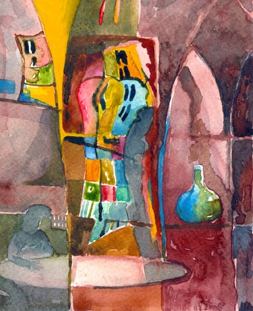
PAT K. really struck out for something new this time, in the form of using figures, really quite recognisable figures, in her work. This might not seem so radical, but there has always been a difficulty in how to use figurative elements in combination with the more abstract nature of Pat's usual way of representing a space (or rather, the FEELING of a space).
 |
| Pat no. 1 |
 |
| Pat no. 2 |
 |
| Pat no. 3 |
 |
| Pat no. 4 |
The thing that really made these work is the way that the figures GROW out of the space. They are not superimposed on a space, nor somehow seperate from it. They belong to the space, and breath the same air! This is particularly true of image no. 2 above.
Much discussion was had, and I think this needs to be explored further next time - play with the simplicity of the context, with suggested figures/objects growing out from it. Very exciting Pat!
GERALD doesn't stop developing! He brought a fabulous set of rich paintings, where the paint (gouache against a dark ground) was really working to define the subject, and as with Pat's, the painting was not just plonked on the paper - it grew out of the paper. Really great, Gerald. This was combined with lovely areas of paint and drawing combined, to suggest heads/areas of detailing. More please.
MAGGIE came up with two very simple (deceptively so) pieces. They were glimpses through into other spaces, and she'd created a fascinating surface pattern with all the fragments that you could guess at through the doorways. That surface pattern was a great counterbalance to the 3-D depth implied by the 'looking-through' description. Very clever.
ELIZABETH had a great selection of different experiments - we can always rely on Elizabeth for pushing her ideas on. Interestingly, the two that worked best were at opposite ends of the tone/colour debate.
One was a symphony of blues and golds as an overall colour chord, with areas of specifically TONAL definition, and fragments of light.
The other was a piece where she'd used lots of colour very cleverly, really understanding that the tones of those colours needed to be fairly even to make the colours really speak.
Then there were other pieces which tended to fall somewhere in between, so those two were the most successful, really. It's totally OK to make paintings using each of these languages, but you just need to be aware of which one you're ending up with in each painting, so you don't get them all muddled, and have both contradicting each other in a painting. Using predominantly tone doesn't mean you can't have lovely colours (such a s blue and gold) - it just means you can't use lots and lots of different colours and expect them to work at their best.
STEPHANIE re-surfaced from her book, and it was really good to see her. She brought some landscape work she'd been working on. My main comment was that she was trying to say everything there possibly was to say about her landscape all in one painting. It's not possible to cram everything in, and make it still readable. My suggestion was that she should us no more than 5 words to describe her subject (landscape in this case), and then paint that. Then she could use another set of words to describe another aspect of the same landscape, and do another painting......and then another etc. - all from the same landscape, but all exploring different, simple aspects.
MANFRED had come to visit, and he brought several sets of photographs and paintings. His paintings were delicious and simple evocations really, essences of a remembered landscape, but really strong and emotionally charged. All they were really were arrangements of horizontal bands of colour and texture, but they were immediately about remembered landscapes in all our minds. Very wonderful, and absolutely what I was saying to Stephanie, who was very struck by them.
LESS IS MORE - FOR SURE!
PENNY. I am really sorry, but for some reason I didn't make notes on you on the day - why??? I can picture some of the work in my mind, but not enough to remember my comments. Oh dear. You can send them through if you wish, or I'll add the comments next time.
No comments:
Post a Comment