Well, this is exciting! What have you all been up to?
The first to send in was
PENNY, with the following :-
"Here are my efforts! Decided to follow your advice from June and make drawings less finished. So have not allowed myself to use tone (well almost not!)
I think that, despite the incredible inaccuracy of the blind drawings, they probably provide a better basis for interesting paintings. I intend to also follow your advice to try painting from memory of the more detailed drawings that i did at County Hall."
 |
| Nr 1. Kids playing in water fountains. |
 |
Nr 2. Blind drawing of helter-skelters and voids in building opposite level 4 blue bar.
Shading done after - probably should have left as line. |
 |
| Nr 4. Blind drawing looking down from blue bar window. |
 |
| Nr 3. View from blue bar. |
 |
| Nr 5. Same view as Nr 4 but looking. |
Penny, I think these are tremendously exciting, as are your plans to work from memory to some degree. This may be the first time you've really let go of the fear of 'not having enough' in a drawing - am I right?
I understand what you say about the patches of dark in drawing no. 2, but all they are are THOUGHTS or possibilities. You don't have to stick to them. I think they are important, because they mark down that set of options, to be used or rejected as you see fit later on. Working from memory, they may well change anyway. It has good possibilities that drawing. You may find no. 1 is a bit 'old Penny' - a bit rigid in its options? No. 3 has a very nice sense of scale and rhythm already, so see what rearrangements happen from memory.
Nos. 4 and 5 have the added problem of perspective. The obvious view of the ambulance (?) from above etc. You will need to decide what to do about that. the others are more flat-on, so don't really present this problem. It's something Jane wrestles with too, on a regular basis.
In your work stemming from Dr. J's house, you got around the problem by having those overlapping plans. The perspective was there, but what was in front and what was behind - a good solution.
Really exciting - can't wait to see what you do with them!!
Next, we have JANE , who sent the following :-
No. 1 - Image of Hungerford Bridge standing on Waterloo Bridge in the howling wind.
Nos. 2 - 5 These images were drawn back in the RFH. Just trying things out. Couldn’t get into colour. Meant to.
 |
| Jane no. 1 |
 |
| Jane nos 2 & 5 |
 |
| Jane nos. 3 & 4 |
 |
| This is an old blind drawing I did of Hungerford Bridge. |
Thank you Jane - an interesting set. I get the feeling (and do say if I'm wrong) that you don't quite know what you want from your drawings at the moment? It is especially interesting to see the older drawing. You were confidently into using the blind drawing overlaps of planes and shapes. The drawings done yesterday are more conventional (nothing wrong in that!), in that they all show a more straightforward interpretation of the relative planes and proportions. There is also an awareness of the use of tone, which again didn't concern you previously. So......hmm! I think one question to ask yourself is what you want to do with all the 'open' spaces - the sky; the foreground etc. Are they going to be 'sky' and 'foreground' or are they going to be component shapes? Are the paintings going to be blocks of carefully arranged colour (and tones of colours), which have Hungerford Bridge embedded in them, or are they going to be paintings of Hungerford Bridge? There is a difference.
The most recent experiments you've shown us have a very sophisticated use of colours AND textures/patterns. You have the imformation for all of these in your drawings, especially in the ones where you've really detailed the wires and criss-crosses of the bridge, and speckles on the beach. I think you have to follow those options, and see where they take you - do some brave texturing and patterning - that will be quite new for you. See what happens.
Think about what I have just said to Penny about the perspective, especially with the curve of the river - what do you want to say spacialy??
So may questions Jane, and no answers from me - sorry. I think you are at one of the moments of being brave and striking out into new territory - always scary, and something where you just have to be brave and carefree (!) , and see what happens. Good luck!!
Next, we have PAT K., who sent in the following :- "At the begining we all said what our intentions for the day included I said I wanted to abstract from the image -intending to avoid the obvious.
The first three drawings were done in front of the subject-the second three from memory when I returned to the fourth floor in the RFH. I felt these went some way towards achieving this! Perhaps something to concentrate on in the future."
 |
| Pat - first 3 |
 |
| Pat - 2nd 3 - from memory |
Well done, Pat! Your first three are very interesting - using various ways to put down what you've seen - line only / line + some colour / lots of colour. I really like them all - they work very well, each of them, in their particular modes of expression. It's rare to see a drawing done just in line/tone from you (your no. 2) and I like it. Maybe it will give you more options later, when you come to work in colour?
Your second set, done away from the subject, are also very interesting. The thing that is most obvious is that you have dropped back into using just a very limited palette - one or two colours. This is different from the first set. Compare espcially with your no.3 in the first set - an image which I find very sensitive and poetic. It is possible that the arrangement of component shapes is more to your liking in the 'memory' set, but think about what you can achieve with a few more colours, when you come to work these up. Think of the relative components - colour-wise and tonally, and how they sit beside each other. Try not to just have the one or two colours which yoiu use everywhere.
This is a very nice set, Pat, and I look forward to seeing what you do with them!
We now have GERALD, who sent in the following :- "I'm attaching some sketches from yesterday mostly of Hungerford Bridge. Taking in your comment about not being too detailed at the sketch stage, I've tried to do mainly semi-memory images, until page 3, which is from Carsten Holler's exhibit at the Hayward Gallery, when tiredness overtook and I reverted to type!"
 |
| Gerald no 3 |
 |
| Gerald no. 2 |
 |
| Gerald no. 1 |
Gerald, your no. 1 page is a bit faint - sorry - I tried to boost it. However, it being a line drawing, it will be interesting to see whether that contains enough information for you to play with! I'm really glad you are trying to break away from 'getting everything in'. I realise that that's scary for you!
I really like the beginnings you've got on sheet no. 2. What you need to see in there is the contrast of the flat areas of tone against the complexity of the more detailed structures. Once you can see it in this manner, rather than being bits of scaffolding (?) against the bridge, then that will give you the freedom to develop those ideas. Those elements are what will make the eventual painting successful or not, not whether they represent a piece of scaffolding. Play with the solid blocks. Make them bigger / smaller PROPORTIONALLY to the other elements, and to the PAPER! Play with the rhythm of the more complex elements.
The eventual paintings can still be scaffolding against bridge, but it's how they all relate to each other that, in the end, makes things work or not.
It is also really clear to look at your page no. 3, and to see that the drawing offers little room for manoeuvre (sp?) - great drawing, but it is what it is!
Enjoy playing, Gerald.
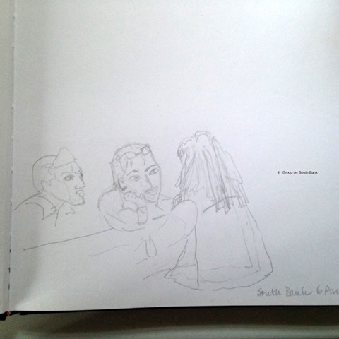
Lastly, we have ELIZABETH, with the following :- "I did these in order of 3, 2, 1. The idea being figures against
more abstract shapes in the window. After showing them to the others we
thought that 2 had been overdone outside and I have removed some of the
marks. The last one, 1 is a simple version of 2 as I thought I had put too
much detail in."
 |
| Elizabeth 1 |
 |
| Elizabeth 2 |
 |
| Elizabeth 3 |
Well, what a great set! I love the idea of the outside shapes (the wiggly slide-things) being part of the inside, almost. No. 3 is fascinating, with the simple line drawing of the figure in the foreground against the complexity behind.
No. 2 IS more detailed, and I don't know what you've taken out, but it works now. It doesn't quite have the magic of the other two, as it's more 'obvious', but that's OK. The bit I'm less sure about is the lower 3rd - the floor/feet area. It doesn't really fit with the rest of it, and maybe is a bit too literal?
I really love the line drawing however. It immediately makes me think of some of Picasso's beautiful and expressive line drawings, or those of Matisse. The lines fill the page very elegantly, and the whole thing is entrancing. How to use it though? What about flatter areas of colour (ie. not tonal like the other two drawings)? Or even a collage?
You're back on form, Elizabeth! Less is more!!
Thank you all, for sending this work in, and for BEING THERE. It would be such a shame for things to fizzle out. I hope this has helped you to move on. The thing that strikes me most is that everyone is being really courageous, and letting go - great! You could send in any resulting work on the 8th September? I will look forward to it.